Banking website · akbars.ru · 2026
Rejected, rebuilt, handed off: a bank’s homepage in under six weeks
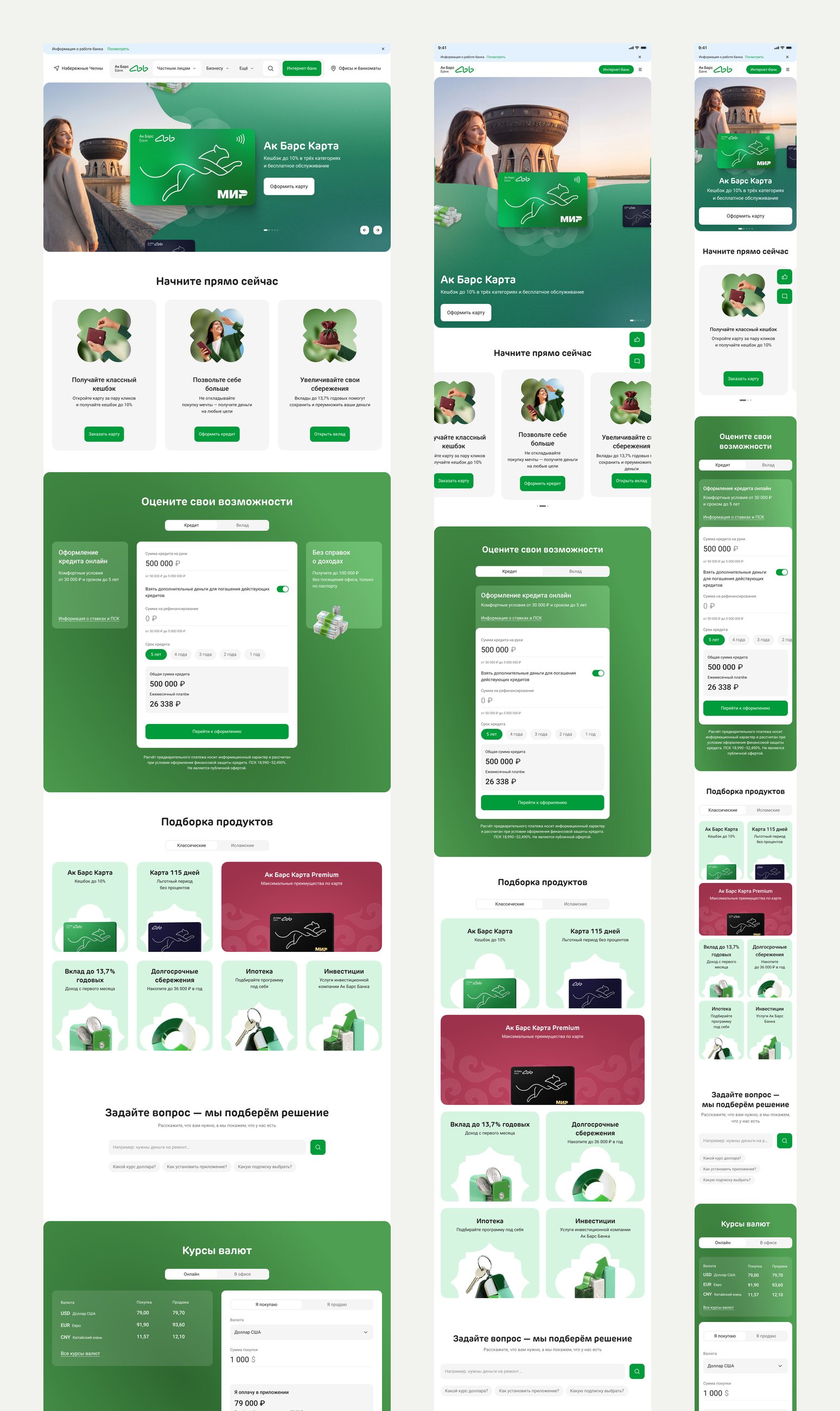
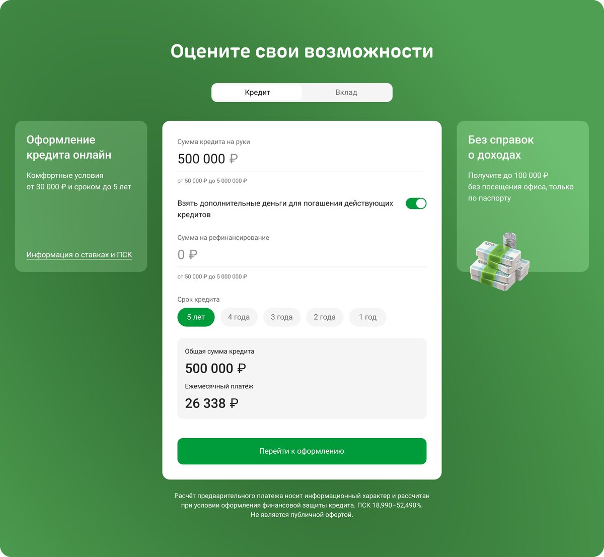
The whole homepage of akbars.ru, the website of Ak Bars Bank from Tatarstan: every block on three breakpoints, from the first-screen banner to the calculator, the product selection, exchange rates and news.
- Task
- Four of the old banner’s five slides showed abstract 3D objects instead of a product, and the business treated an outside agency’s homepage as the default.
- What I did
- Designed the whole homepage from 5 September to handoff: every block on three breakpoints, from the banner to the calculator, the product selection and the news, with two reviews with the business along the way.
- Result
- The whole page went to development on 13 October. Our banner concept won over two variants on the agency’s layout, and our product selection was rated above the agency’s. Banner click-through grew from 0.9% to 1.6% in the first month.
Context
- Business
- The bank was moving akbars.ru to a new React front end, with the homepage due on 15 October. An outside agency had audited the old site and drawn its own homepage, and the team planned to build on it, so every difference had to name the problem it solved.
- People
- Clients come for a card, a deposit or a loan, most of them on a phone. The audit found that most mobile users never swiped the carousel.
- Constraints
- Four banner slides, one per product. Rates used to be baked into images, lawyers decided what could appear in photos, and the site won’t be redesigned for about ten years.
My role
I led the redesign of akbars.ru from 5 September and designed the whole homepage: the banner, the quick-start cards, the calculator, the product selection, search, exchange rates, promotions, news and the bank’s key facts, each on three breakpoints. I presented the work alongside the redesign’s business owner and prepared the handoff. A design lead reviewed it; a 3D artist, a design-system designer and another designer made the product icons, the components and the product images.
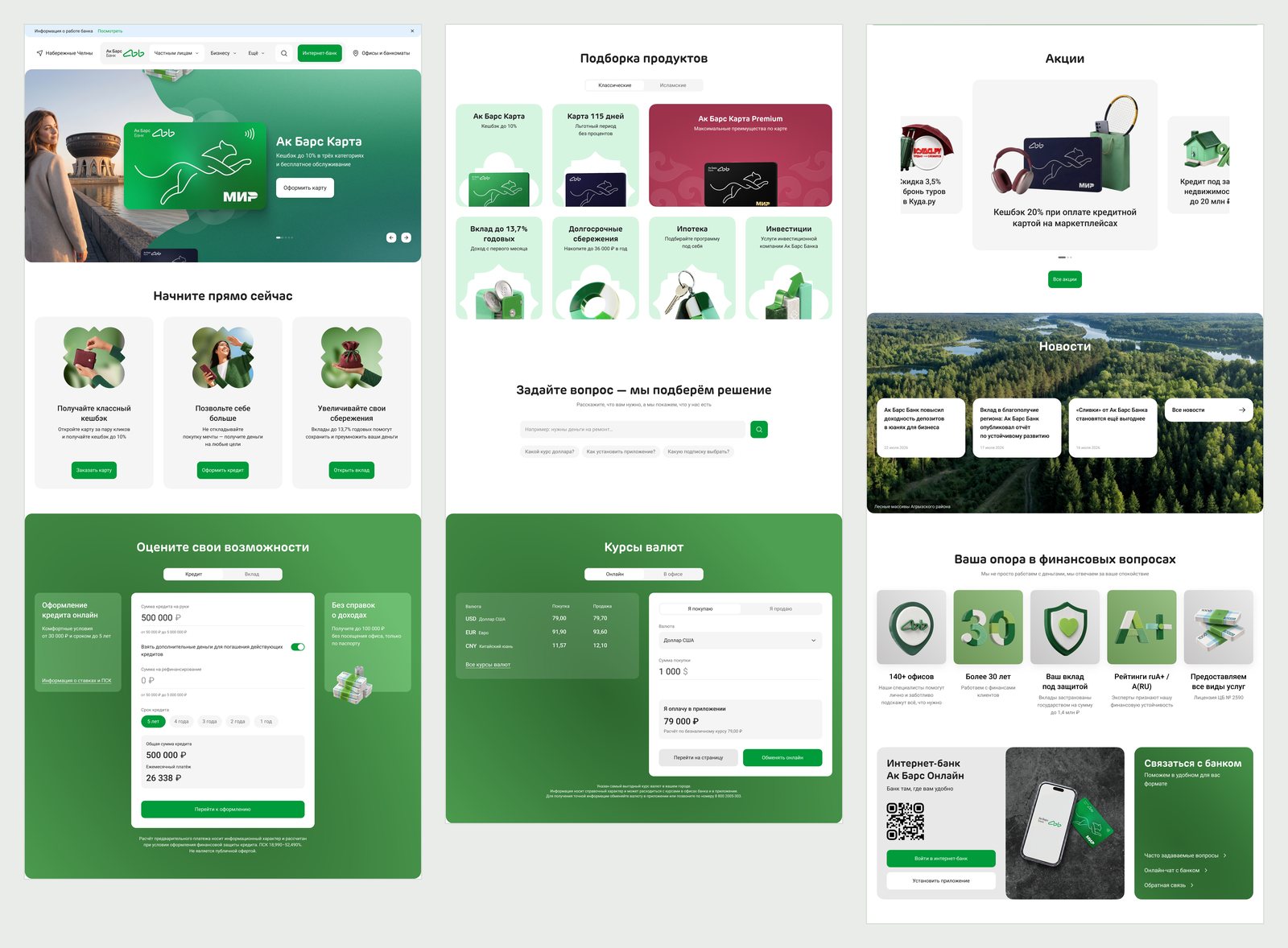
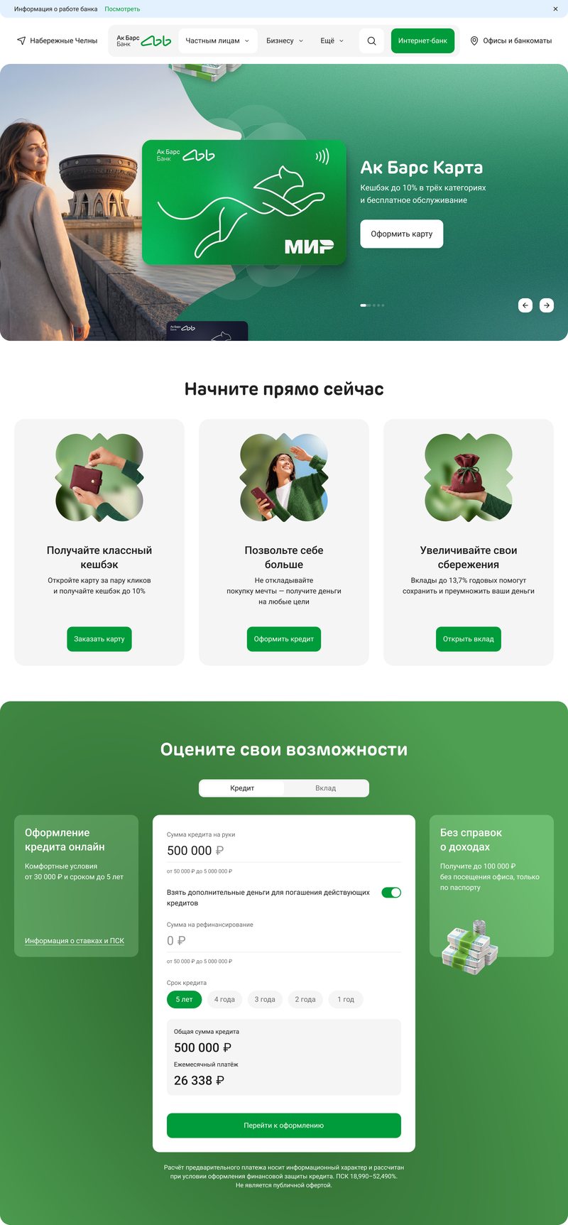
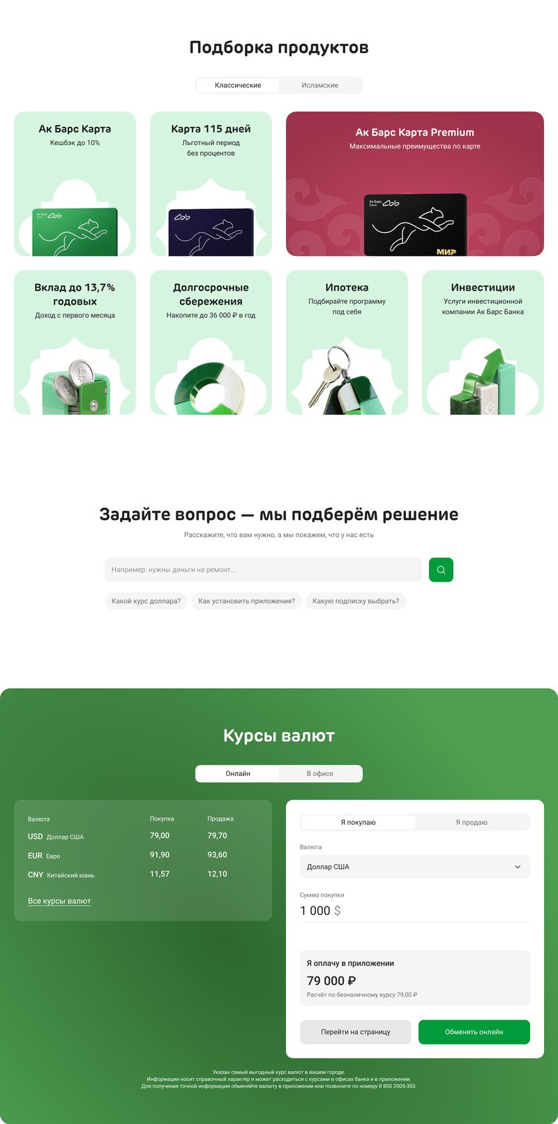
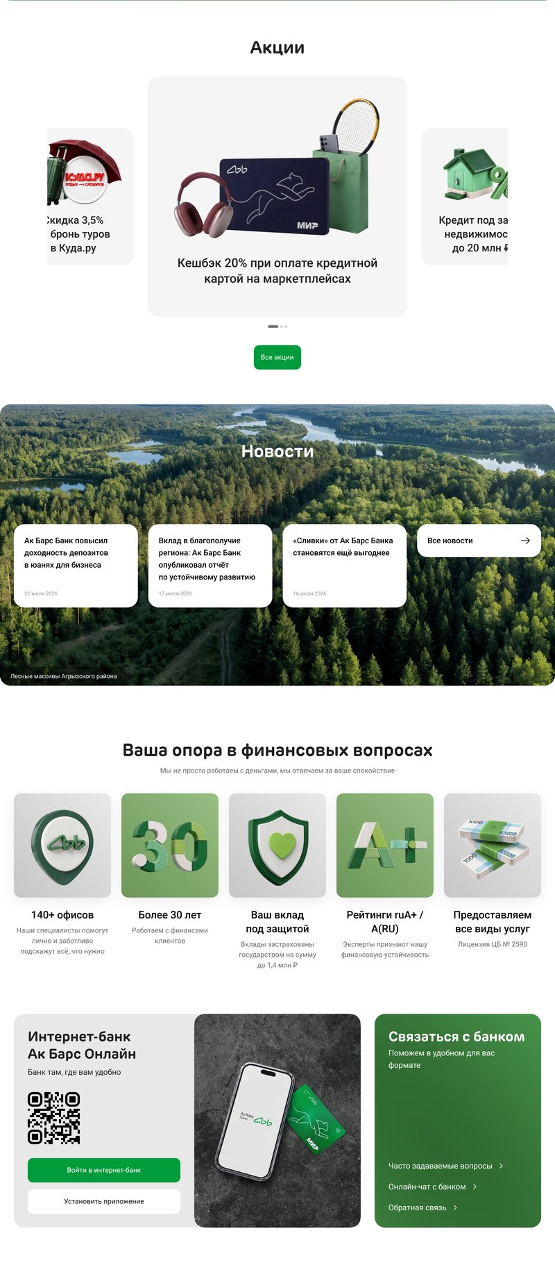
The whole homepage on desktop, top to bottom: the banner, quick-start cards and the calculator; the product selection, search and exchange rates; promotions, news, the bank’s key facts and the app.
Key decisions
After a “no”, the product comes first
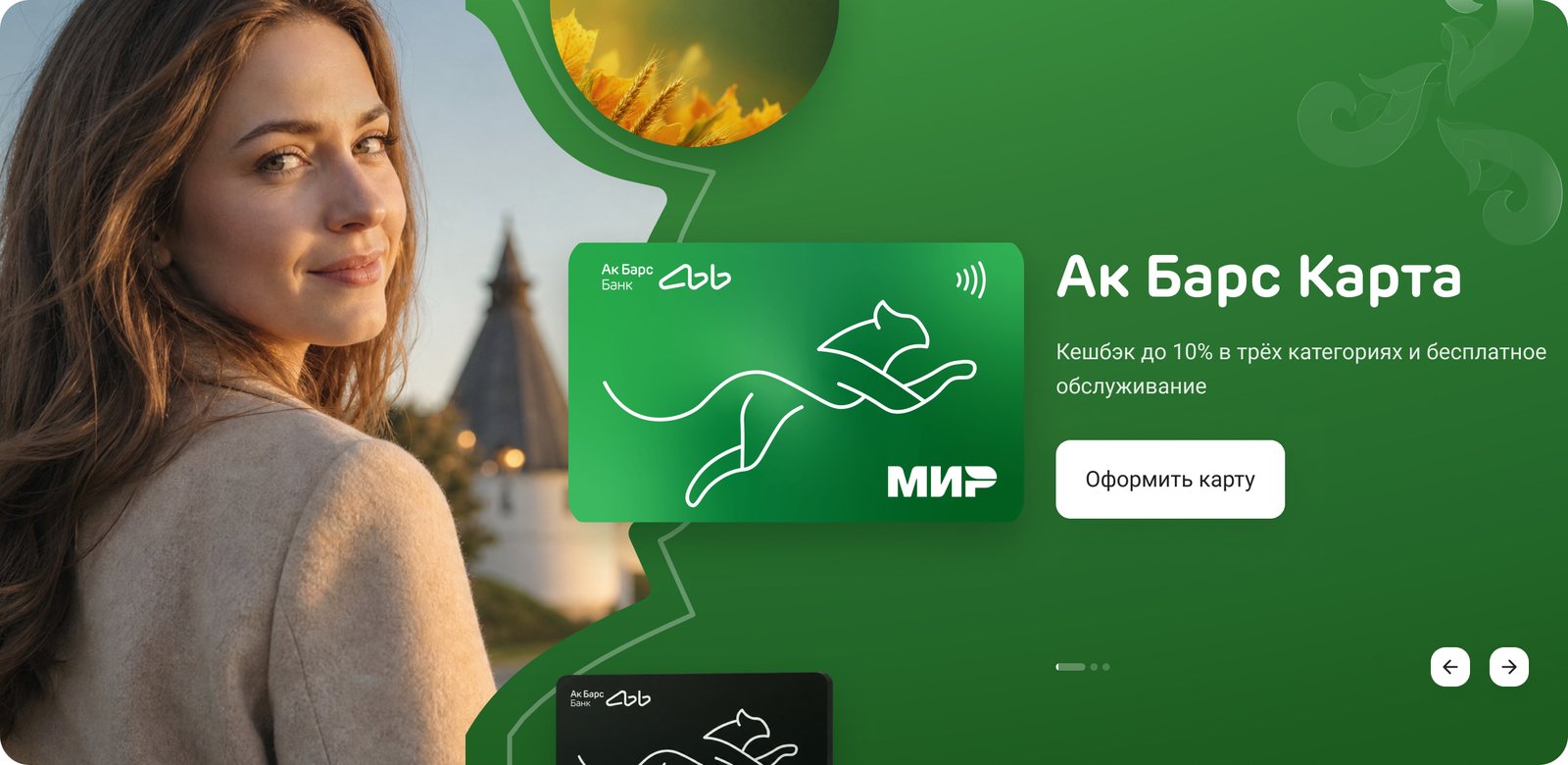
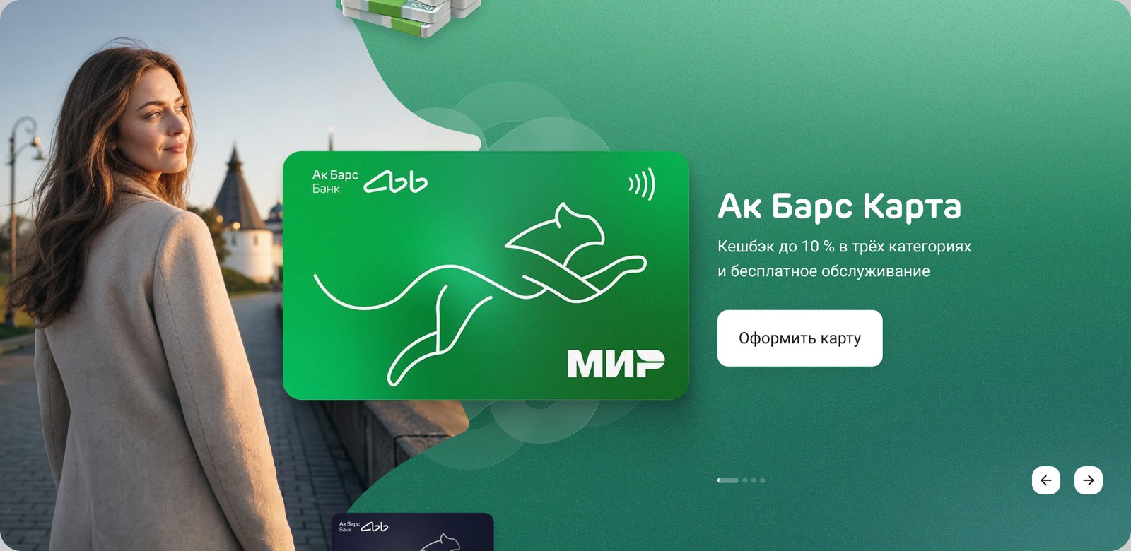
The business rejected the first web banner: the model dominated and the product looked small. The rebuild made the product bigger and its neighbours 0.4 of its size.
On static boards the business read the banner as a photo of a person, not an offer, and “motion will draw the eye” didn’t convince them. The team’s base plan was the agency’s layout, so I prepared it too: three options turned “ours versus theirs” into a choice.
It became the favourite: the motion catches the eye as the page scrolls, and the product always sits in the centre.
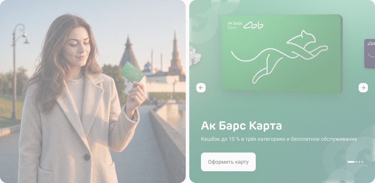
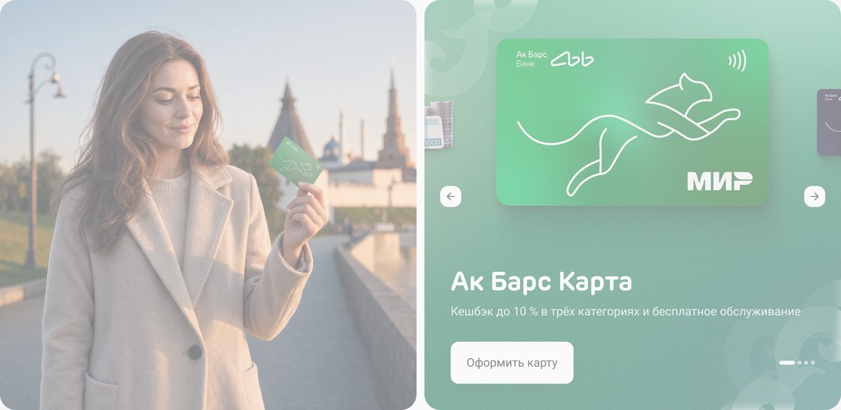
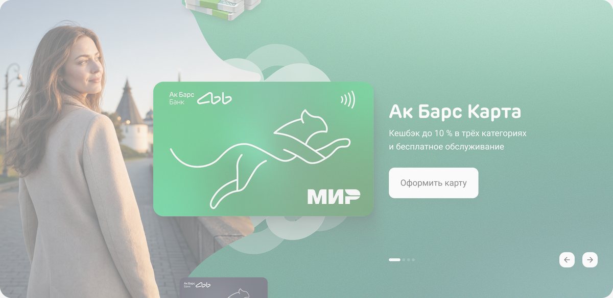
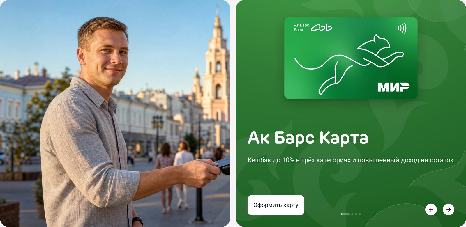
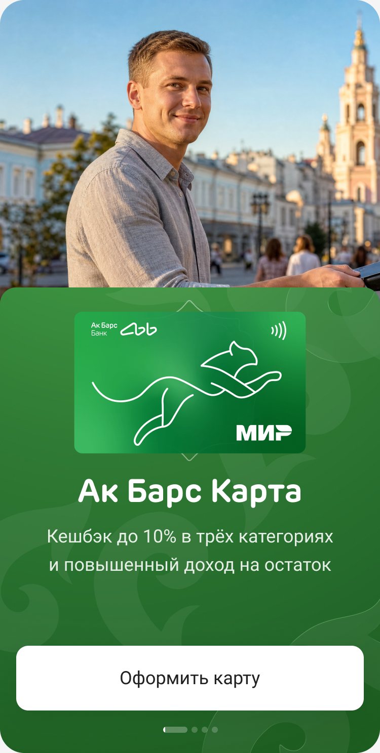
Also dropped along the way: the photo-and-product diptych above, a calculator inside the banner, a type-only banner, a dense pattern that read as Turkish rather than Tatar, and glows around the product.
One style for the whole page
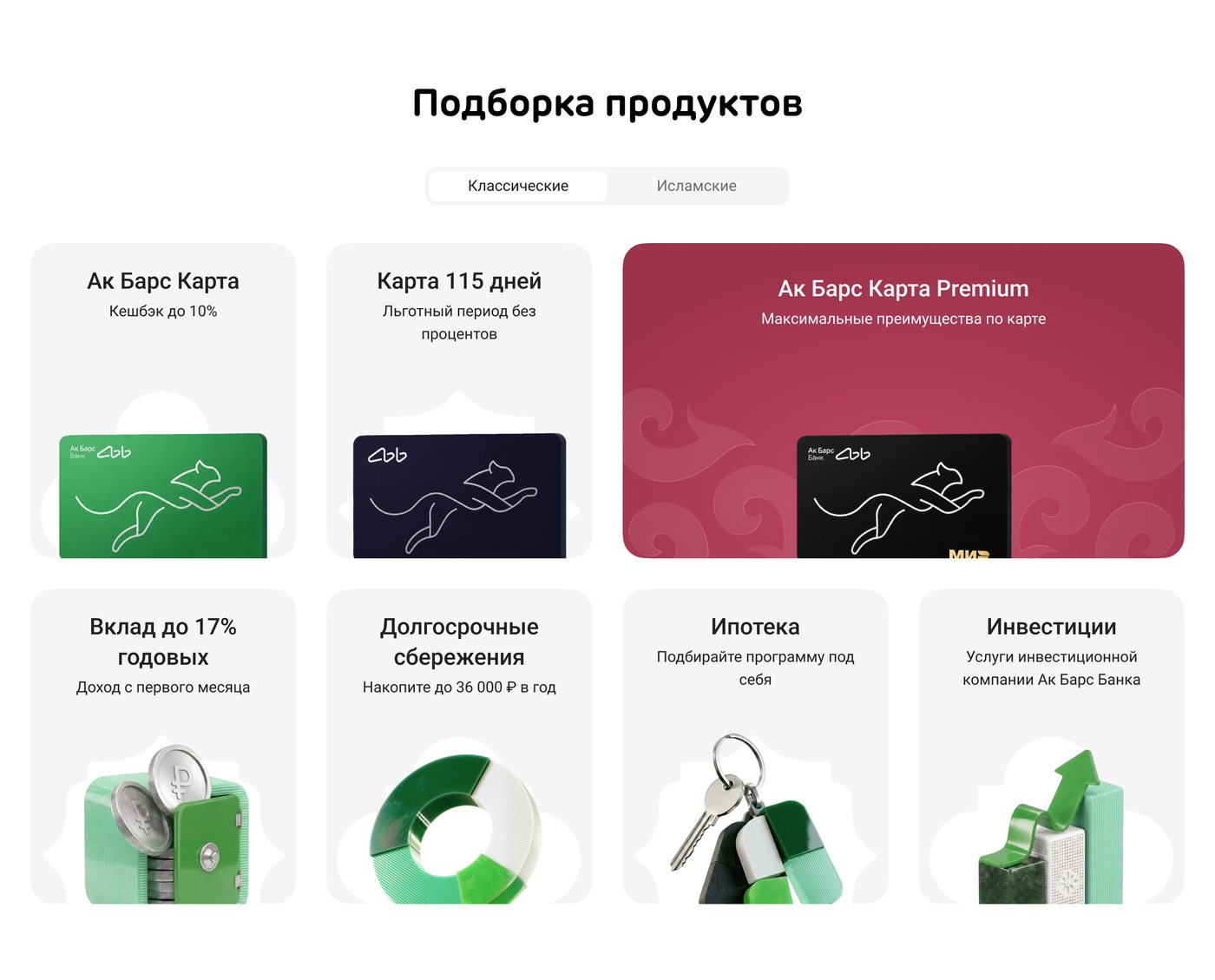
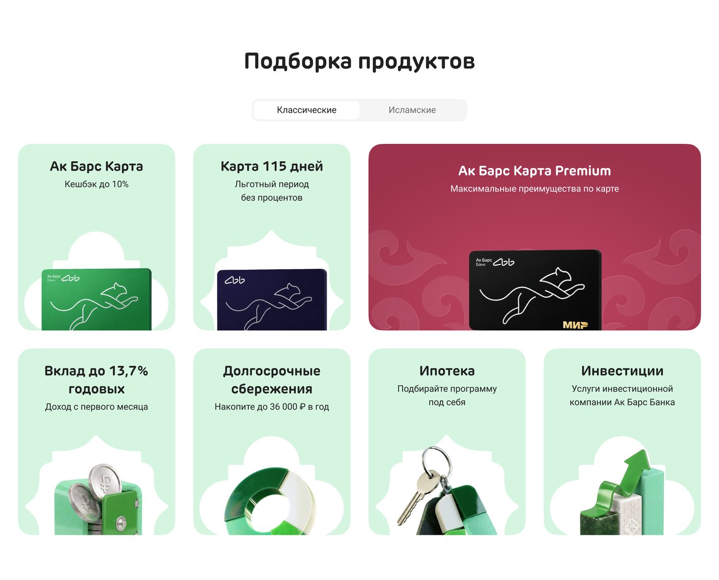
Grey tiles became mint, the white arch behind each product opened up, and the titles got bolder. Burgundy stayed for Premium as the one deliberate accent.
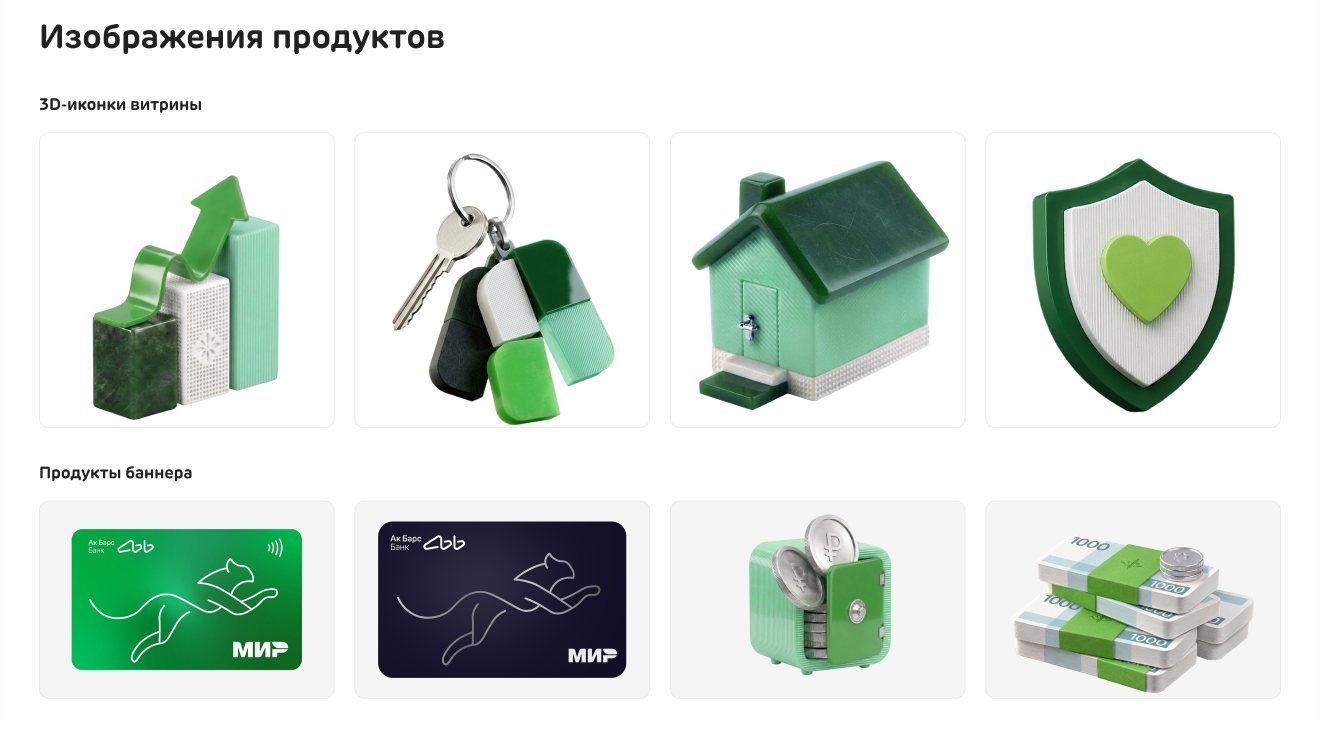
The business saw “one convex card and a grey mass behind it”, and one stakeholder said the page had volume at the top and went flat below. So the selection took the banner’s language: 3D products, an ornamental arch behind each one, the same greens. After the next call the icons were trimmed so the titles read first.
Two segments, Classic and Islamic, instead of the six audiences in the bank’s strategy: a segment builder needs the new back office.
A warm background, a blue Premium, a “duo of flagships”, a green block that would have reordered the page, and a showcase per audience.
Real places, checked against real photos
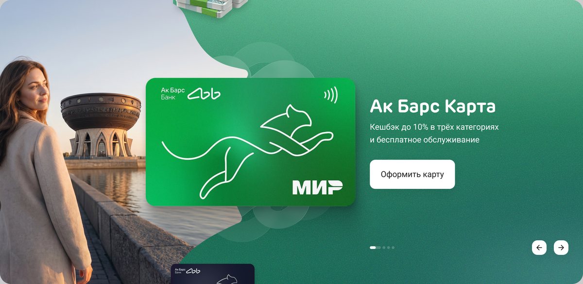
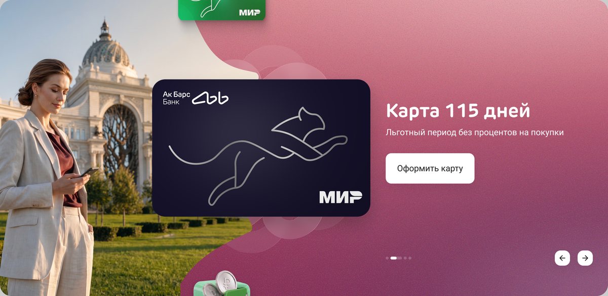
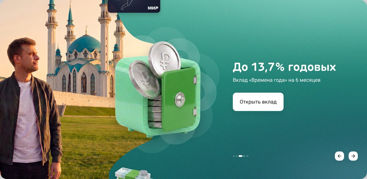
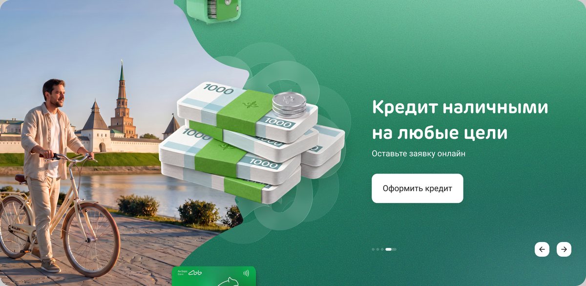
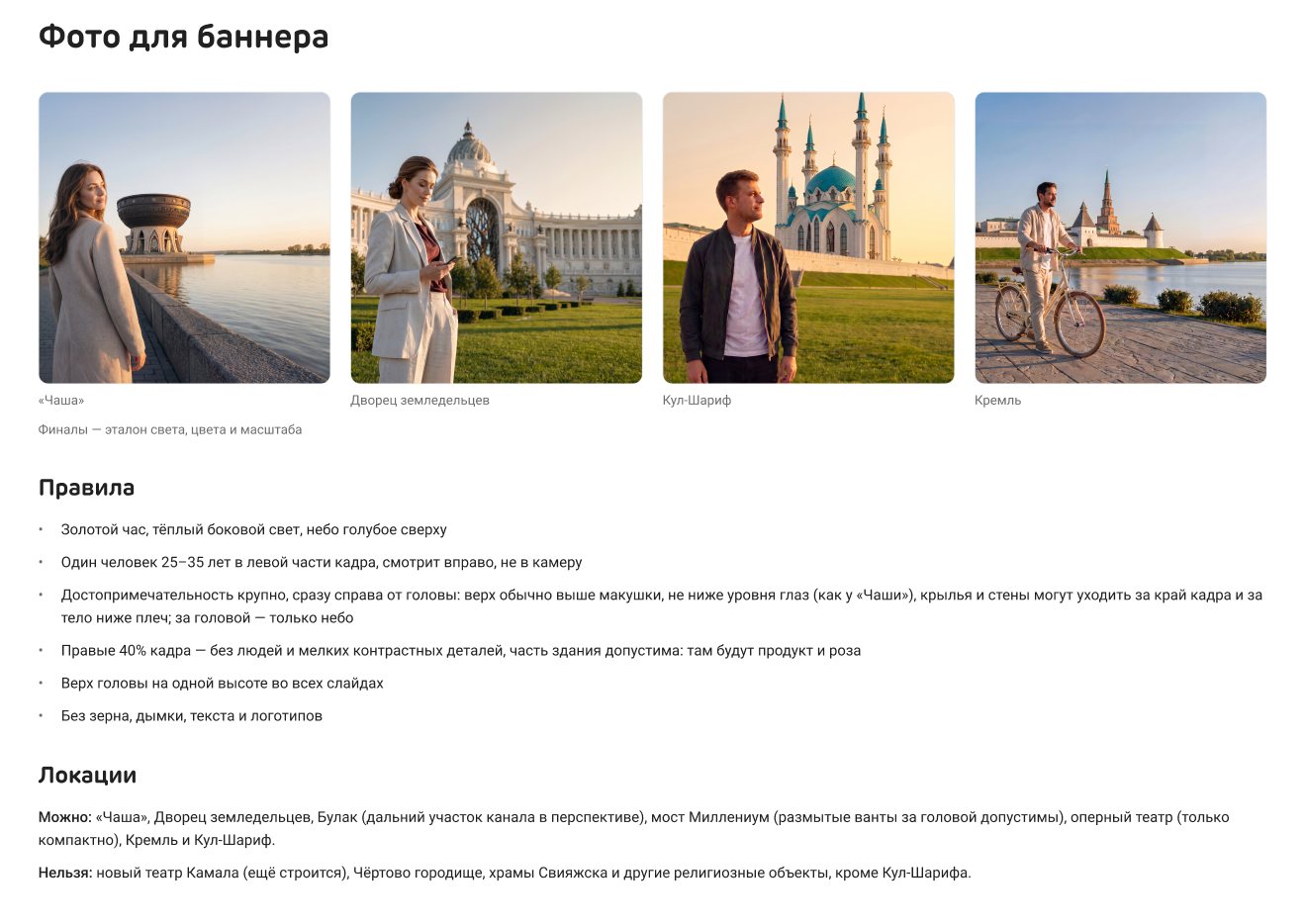
One person and one Kazan landmark per slide, in golden-hour light: the Kazan Family Centre, the Palace of Farmers, the Kul Sharif mosque and the Kremlin.
Local clients know these places, and a wrong detail breaks trust faster than a stock photo. I turned the agency’s photo style into seven rules (golden hour, one person in the left third, the landmark behind the shoulder) and prompt templates.
Sites that didn’t read as Kazan at banner size and a render with an impossible pose. Lawyers cleared the Kremlin and the mosque only on 12 October.
Details
One page in three layouts from one set of components.
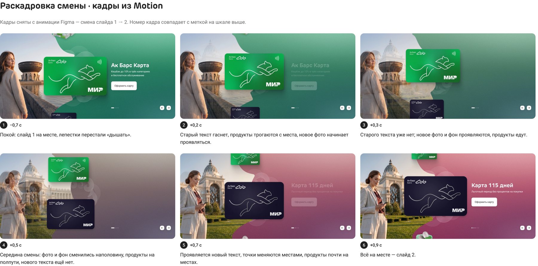
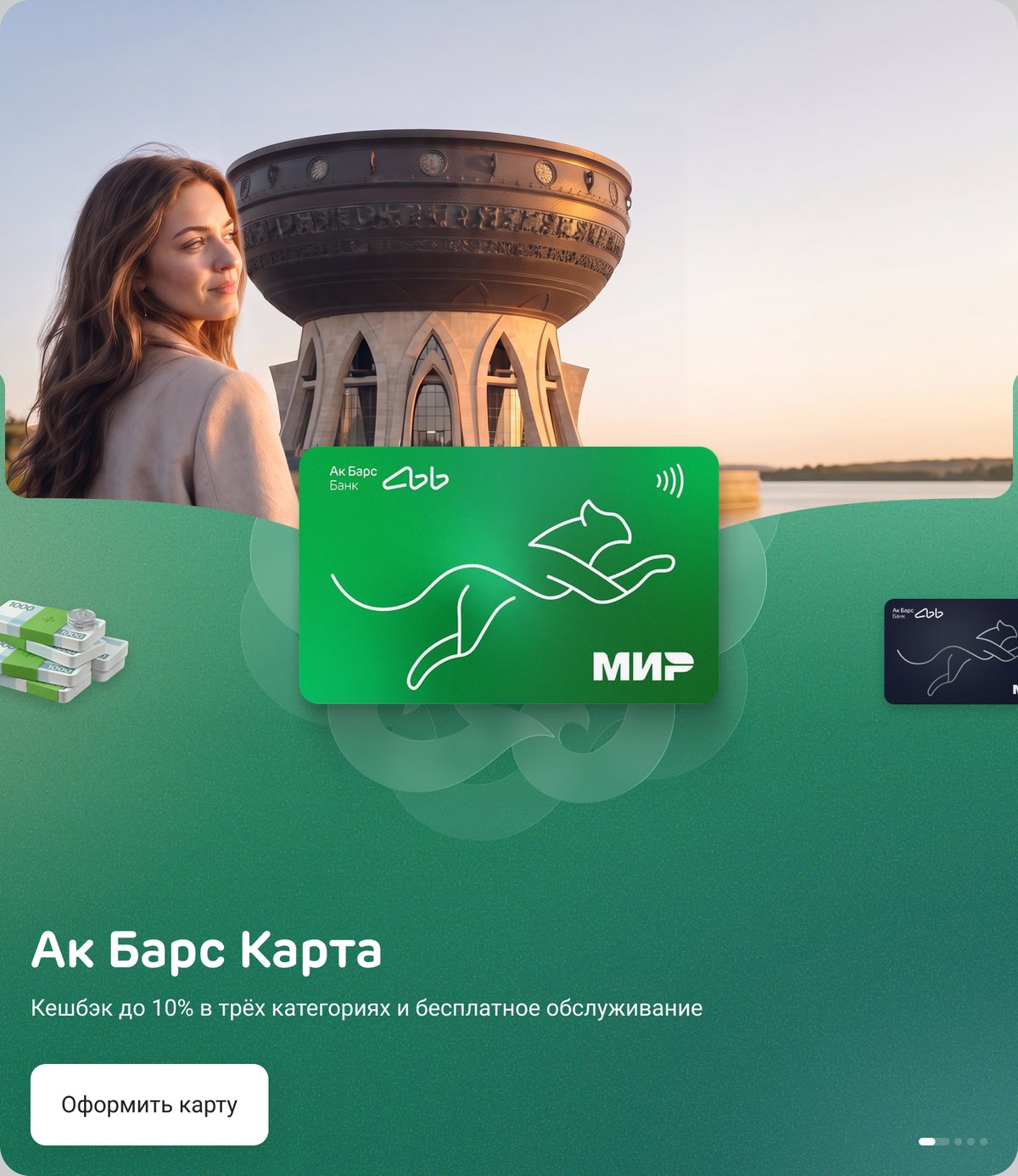
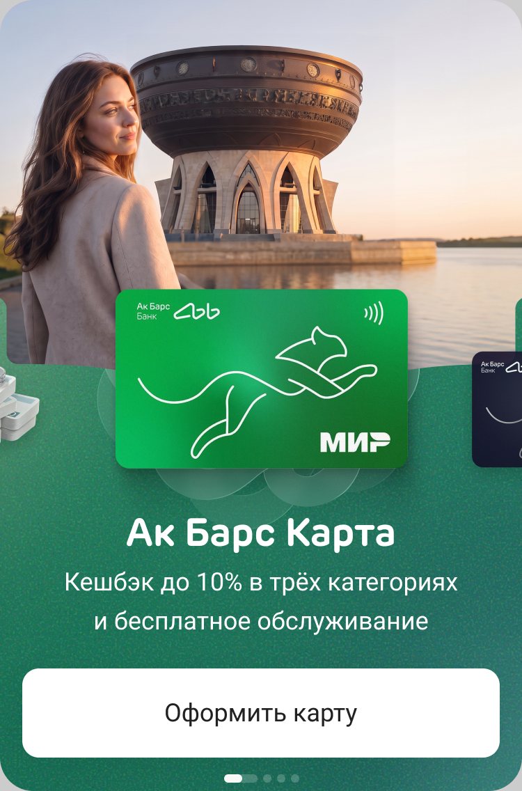
The same slide on tablet and mobile: the orbit turns horizontal and the neighbouring products peek in from the sides.
- Every remark answered. After the first review I kept a table: what the business said, how the new version answers it, what is still open, each with a check anyone could repeat, such as text contrast or a product’s visual weight against the card.
- Three breakpoints, one banner component. A vertical orbit on desktop, a horizontal one on tablet and mobile.
- A spec and an image guide. Pauses, reduced motion, fast clicks and breakpoint changes, a 39-point acceptance checklist, and prompt templates for new slides.
Working with AI
AI agents were my production crew: they built banner and selection variants and Motion tracks in Figma to my specs, measured contrast and visual weight, reviewed variants in critic panels and drafted the spec. The photos were generated with image models. The direction, the cuts and the pitch were mine; I threw out broken renders and checked every landmark.
Results
- Our banner concept became the favourite at the 5 October review, ahead of two variants on the agency’s layout.
- The design review rated our product selection above the agency’s.
- Handed off on 13 October: every block of the page on three breakpoints, plus a banner component, Motion references, a spec and an image guide. Live since October 2026.
Takeaways
- A still frame has to sell on its own. Reviews happen on static screens; motion can add to a layout but can’t rescue it.
- Style belongs to the page, not to a block. The selection looked flat only under a banner with volume; the fix was a shared language, not a brighter block.
- Bring the alternatives yourself. Three options made the choice about the work, not about whose idea it was.